
GRIT CLUB
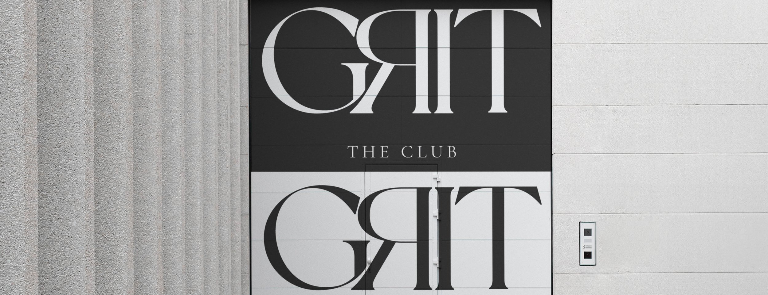

THE GRIT CLUB Bungalow 28 was commissioned to position, define and sharpen The Grit Club. An innovative community that solves employee disengagement and promotes career progression. The thinking behind this approach was to infuse a certain serenity with the already–robust and strong word – that is, Grit. It follows a strict typographic design that features delicate hairlines and curves for maximum contrast.

We designed the identity of The Grit Club to reaffirm the brand’s positioning.
The typography we used for both primary and secondary words is from the Serif Family that has an indelible influence on luxury publishing. We slightly elevated the curve at G and reversed the letter R to cover any negative spaces between the letters. This way, the lower, down sloping stroke of letter R (i.e. the leg) evokes dynamism and the subliminal message of stepping into our power to conquer success.
Bungalow Digital has now commenced a collaborative partnership with The Grit Club, focusing on platform design, social media and paid amplification, CRM growth and content writing.
From brand architecture, naming and creation to redesign of visual identity, manifestos, brand book & graphic charts, we unearth the soul amid digital.